Data-Driven Storytelling: Turning Analysis Into Decisions

Data-driven storytelling is the practice of building a clear narrative around data and presenting it with visuals, context, and structure so an audience understands what the numbers mean and what to do about them. It combines three elements: the data itself, a visual representation, and a narrative that connects them to a decision.
Key Takeaways
- Data-driven storytelling pairs analysis with narrative and visuals so decision-makers grasp meaning quickly, not just see numbers.
- Effective data stories follow a structure: set context, reveal the insight, show the evidence, and end with a clear implication or action.
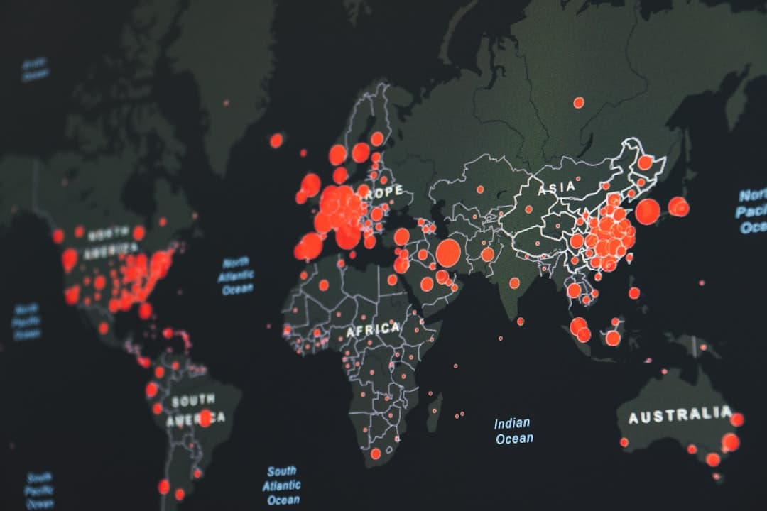
- For spatial data, place is often the through-line, which is why maps and tools like Esri StoryMaps are powerful storytelling formats.
- A data story is built for a specific audience; the same dataset becomes a different story for an analyst, an executive, and the public.
- The goal is decision, not decoration; charts and maps exist to move an audience toward understanding and action, not to impress.
What is data-driven storytelling?
Data-driven storytelling is the discipline of turning analysis into a narrative that an audience can follow and act on. It rests on three pillars working together: the data (the evidence), the visuals (charts, maps, and graphics that make patterns visible), and the narrative (the framing that tells the audience why the data matters and what it implies). Remove any one and the result weakens. Data without narrative is a spreadsheet. Narrative without data is an opinion. Visuals without either is decoration.
The reason this matters is human, not technical. People remember stories far better than statistics, and they make decisions based on understanding, not on raw access to information. A well-built data story closes the gap between “here is what the analysis found” and “here is what we should do,” which is the gap where most reports fail. For geospatial work in particular, this gap is where good analysis often dies, because a technically correct map means nothing to a budget holder who cannot read what it implies.
Why does data-driven storytelling matter for decisions?
Most organizations do not suffer from a shortage of data. They suffer from a shortage of meaning. Analysts produce dashboards, maps, and models, and then watch those outputs stall because the audience cannot translate them into a decision. Data-driven storytelling is the bridge. It takes a defensible analysis and frames it so a non-technical stakeholder can see the situation, understand the finding, and feel confident acting on it.
This is especially true when securing budget or buy-in. A project that needs funding does not win on the strength of its data alone; it wins on the strength of the story told with that data. Our guide on creating a StoryMap that gets funding approved walks through exactly this dynamic for spatial projects, where a clear narrative often determines whether a proposal advances.
How do you structure a data story?
Strong data stories tend to follow a recognizable arc. The structure below is a reliable starting point that adapts to most audiences and subjects.
- Set the context. Open with the situation and the question. Why are we looking at this data, and what decision hangs on it? Context orients the audience before any number appears.
- Reveal the insight. State the single most important finding plainly and early. Lead with the conclusion, not the methodology. Audiences should know the point before they see the proof.
- Show the evidence. Support the insight with the visuals and data that make it credible. This is where charts and maps do their work, each one earning its place by advancing the argument.
- Land the implication. Close with what it means and what should happen next. A data story without a “so what” leaves the audience informed but not moved.
The order matters. Burying the insight behind a wall of methodology is the most common way good analysis loses its audience. Lead with meaning, then justify it.
How is spatial data storytelling different?
When data has a geographic dimension, place becomes a natural narrative spine. A story about wildfire risk, service gaps, or market expansion is, at its heart, a story about where. Maps let an audience see relationships that a table hides entirely: clustering, proximity, spread, and inequality across space. This is why spatial storytelling, the use of maps as a primary narrative device, is so effective for geographic subjects.
Esri StoryMaps is the most widely used tool for this. An Esri StoryMap is a web-based format that combines interactive maps with text, images, and multimedia in a scrolling narrative, letting an author guide a reader through a place-based argument step by step. It is purpose-built for the data-driven storytelling arc described above. For a deeper introduction, see our overview of what an Esri StoryMap is, and for inspiration, our collection of StoryMap examples that changed decisions.
How do you choose the right visual?
Every chart or map in a data story should answer a specific question, and the question determines the format. Comparisons across categories suit bar charts. Trends over time suit line charts. Parts of a whole suit a single, restrained proportion chart. Relationships between two variables suit scatter plots. And anything fundamentally about location suits a map. Choosing a format because it looks impressive rather than because it fits the question is a reliable way to confuse an audience.
Restraint is a virtue. A data story with three well-chosen visuals usually outperforms one with ten, because each visual that does not advance the argument competes for attention with the ones that do. The same applies to maps: a focused choropleth or a single annotated layer often communicates more than a dense map crowded with every available dataset. For the mechanics of choosing and designing those visuals, our guide to GIS data visualization goes into detail.
How do you tailor a story to its audience?
The same dataset is many different stories depending on who is listening. An analyst wants methodology, confidence, and the ability to interrogate the data. An executive wants the headline, the implication, and the decision, with detail available but not foregrounded. A public audience wants a clear, human narrative with minimal jargon. Building one story and pushing it to all three audiences is a common failure, because what reassures an analyst overwhelms an executive, and what engages the public bores a specialist.
The practical move is to identify the primary audience before building anything, then design the structure, language, and depth for that audience specifically. Secondary audiences can be served with appendices, linked detail, or an interactive format that lets readers go deeper on demand. This audience-first discipline is what separates a presentation that lands from one that is technically complete but ignored.
What does it take to do this well at an organizational level?
Individual data stories can be crafted by a skilled analyst, but doing this consistently across an organization requires more: agreed visual standards, a repeatable narrative framework, and tools that make it fast to go from analysis to publishable story. Organizations that treat storytelling as a one-off scramble before each big meeting tend to produce uneven results, while those that build it into their workflow turn every analysis into a communicable asset. For teams that want to operationalize this, especially around spatial data, our overview of GIS data visualization and our GIS consulting services guide explain how the capability is built and handed off.
Frequently Asked Questions
What is the difference between data visualization and data storytelling?
Data visualization is the act of representing data graphically through charts and maps. Data storytelling wraps those visuals in narrative and context so the audience understands the meaning and the implied action. Visualization is a component of storytelling, not a substitute for it.
Do I need special tools for data-driven storytelling?
Not necessarily, but the right tools help. For spatial subjects, Esri StoryMaps and ArcGIS Dashboards are purpose-built to combine maps, narrative, and live data. For general subjects, a clear structure and disciplined chart choices matter more than any specific software.
How long should a data story be?
As long as it needs to be and no longer. The structure (context, insight, evidence, implication) should drive length, not a word count. A single chart with a sharp narrative can be a complete data story if it answers the question and points to an action.
What is the most common mistake in data storytelling?
Leading with methodology instead of meaning. Audiences disengage when made to wade through how the analysis was done before learning what it found. State the insight early, then support it with evidence.
How does spatial data fit into storytelling?
When data has a location, place becomes the natural through-line of the story. Maps reveal spatial relationships that tables hide, and formats like Esri StoryMaps let an author guide a reader through a place-based narrative, making geography the spine of the argument.
Have analysis that is not landing with the people who make the decisions? GeoLever turns spatial data into decisions, stories, and systems, scoped and quoted within 48 hours of a 30-minute discovery call. Book a discovery call or start with the StoryMap-in-a-Week starter.