GIS Dashboards: How to Turn Live Spatial Data Into Decisions

A GIS dashboard is a live, single-screen view that turns spatial data into indicators, charts, and maps decision-makers can read at a glance. Built with ArcGIS Dashboards on the ArcGIS Online platform, it connects directly to your feature service layers, so the numbers and maps update as the underlying data changes, with no manual refresh.
Where a map answers “where is it,” a dashboard answers “how are we doing, right now.” For operations managers, program leads, and executives who need to monitor a situation rather than explore a dataset, a well-built dashboard becomes the screen they keep open all day. This guide covers what a GIS dashboard is, how it differs from other ArcGIS formats, what makes one genuinely useful, and how to plan a build.
What a GIS Dashboard Does
ArcGIS Dashboards assembles a set of visual elements, indicators, gauges, charts, lists, and one or more maps, onto a single layout that fits a screen without scrolling. Each element is bound to live data from a feature service, and the elements talk to each other. Click a region on the map and the charts filter to that region. Select a category in a list and the indicators recalculate. That interactivity is what makes a dashboard a thinking tool rather than a static report.
The data behind a dashboard is hosted in ArcGIS Online or ArcGIS Enterprise as feature services. When a field crew updates a record in ArcGIS Field Maps or a sensor feed posts a new value, the dashboard reflects it. This live connection is the core difference between a dashboard and a slide deck someone rebuilds every Monday.
Common dashboard elements
- Indicators. Big-number tiles for the metrics that matter most, often with a reference value and trend arrow.
- Charts. Bar, line, and pie visualizations driven by the same live layers as the map.
- Maps. An interactive web map, frequently the centerpiece, that filters the rest of the dashboard on selection.
- Lists. Scrollable records that update with the current filter, useful for work queues.
- Category selectors and filters. Controls that let the viewer narrow the whole dashboard to a region, status, or time window.
Dashboard, StoryMap, or Web Map?
Three ArcGIS Online formats get confused constantly. Choosing the right one is the difference between a tool people use and one they ignore.
| Format | Question it answers | Update cadence | Typical viewer |
|---|---|---|---|
| ArcGIS Dashboard | How are we doing right now? | Live, continuous | Operations, managers, executives |
| Esri StoryMap | What is the story here? | Periodic, narrative | Funders, public, stakeholders |
| Web map | Where is it and what is near it? | On demand | Analysts, field staff |
If you need to persuade an audience with a guided narrative, a StoryMap is the right call, and our guide on StoryMaps versus static maps explains when. If you need a flexible exploration surface or a configurable app, ArcGIS Experience Builder gives you more layout freedom than Dashboards. For monitoring, the dashboard wins. A dashboard is part of the wider practice of GIS data visualization, which covers the full range of ways to turn spatial data into decisions.
Where Dashboards Earn Their Keep
Dashboards are strongest wherever a situation changes over time and someone is accountable for responding to it.
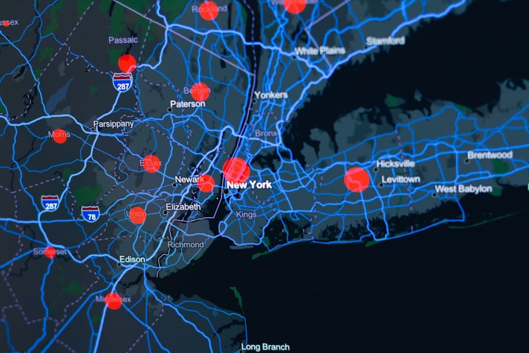
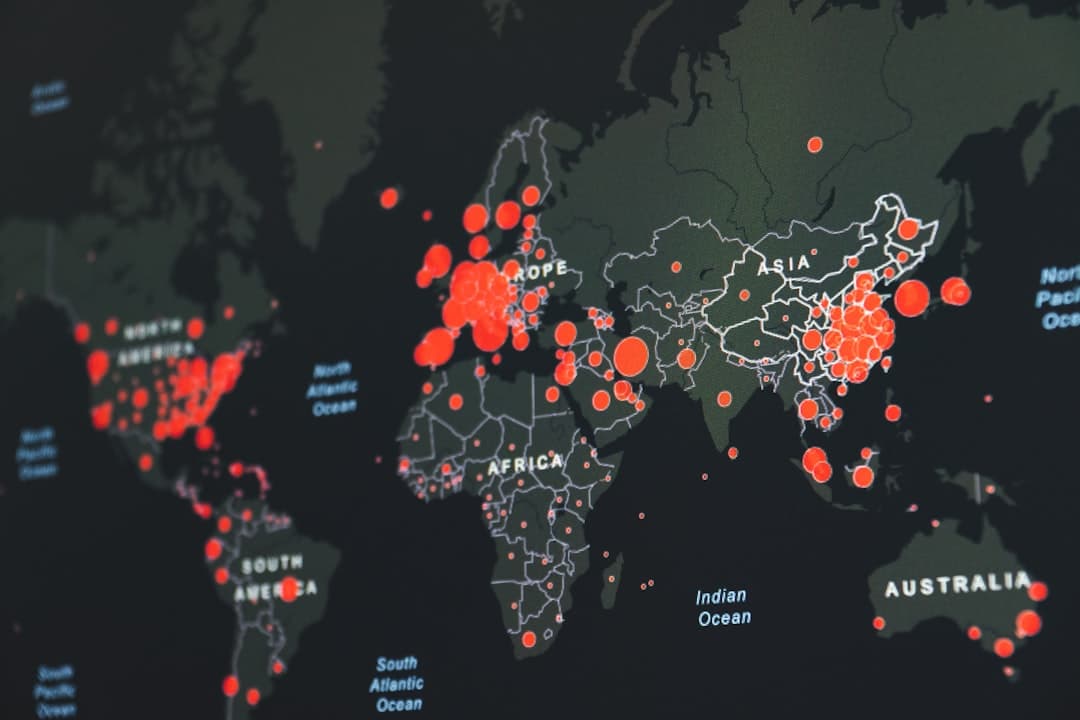
Operational monitoring
Utilities track outages and crew locations, public works tracks service requests, and emergency managers track incidents on a live map. The dashboard gives the operations room one shared picture. For the utility sector specifically, see our deep dive on GIS for utilities.
Program and performance reporting
A program manager who needs to show progress against targets can replace the monthly slide rebuild with a dashboard that is always current. Leadership opens a link instead of waiting for a report.
Local government service delivery
Cities and counties use dashboards for permit volumes, code enforcement, capital projects, and constituent requests, often with a public-facing version for transparency. Our guide to GIS for local government covers how these fit into a broader municipal GIS program.
Field operations feedback loops
When crews collect data in ArcGIS Field Maps or Survey123, a dashboard closes the loop by showing supervisors what is coming in as it arrives. Inspections, asset condition, and damage assessments all benefit from this near-real-time visibility.
What Separates a Useful Dashboard From a Cluttered One
The tool makes it easy to add elements, which is exactly why so many dashboards end up cramped and unreadable. A dashboard that drives decisions follows a few principles.
Design around one or two questions
The best dashboards start with a question the viewer needs answered every time they open it. Everything on the screen should help answer that question. If an element does not, it belongs on a different dashboard or a linked detail view.
Respect the screen
A dashboard is meant to fit a screen without scrolling. That constraint forces prioritization. Five well-chosen indicators beat fifteen competing ones. When stakeholders ask for more, the right answer is often a second focused dashboard rather than a more crowded first one.
Build on a solid data foundation
A dashboard inherits the quality of its feature services. If the underlying layers have inconsistent attributes or slow query performance, the dashboard feels sluggish and shows messy numbers. Getting the geodatabase and feature service design right is unglamorous work that determines whether the dashboard is trustworthy. Where many editors update the same data, branched versioning keeps the live layers conflict-free.
Plan for the audience and the device
An operations-center wall display, an executive’s laptop, and a public web page have different needs. Configuring the layout and interactivity for the actual viewing context is part of doing the job well, and it is easy to overlook until the dashboard ships and feels wrong.
Planning a Dashboard Build
A dashboard project is usually small in calendar time and large in clarifying conversations. The build itself is fast once three things are settled: the decision the dashboard supports, the data layers that feed it, and who maintains it after launch.
Maintenance is the part teams forget. A dashboard is a living product. Layers change, definitions drift, and new questions appear. Deciding upfront who owns the dashboard keeps it from quietly going stale, which is the most common way a promising dashboard loses its audience.
Dashboard Development With GeoLever
Many GIS teams can stand up a basic dashboard. The reasons to bring in a partner are usually the data engineering underneath it and the design discipline on top of it. A dashboard that connects to clean, well-modeled feature services and shows only what matters is harder to build than it looks.
GeoLever delivers dashboard work through GeoConsult, our ArcGIS platform consulting service, scoped to data complexity and the number of connected sources. Across the market, platform consulting engagements of this kind commonly run from $5,000 to $15,000 per project. For organizations that need ongoing dashboard and platform support rather than a one-time build, GeoPartner provides embedded GIS consulting, an arrangement that industry-wide typically falls between $10,000 and $25,000 per month. Lighter visualization deliverables that center on storytelling are handled through GeoStory, and comparable GIS storytelling projects generally range from $2,500 to $7,500 across the market. GeoLever scopes and quotes each engagement within 48 hours of a 30-minute discovery call. For a fixed entry point, our productized StoryMap-in-a-Week, starting at $3,500, gets a first dashboard or map into your hands fast.
The work is led by Diana Muresan, a Senior GIS Engineer and Certified ArcGIS Expert with deep experience in geodatabase architecture and the ArcGIS Online and Enterprise platforms. Because GeoLever is a focused two-partner firm, the person who designs your dashboard is the person who builds it. You can see how dashboards sit within our wider GIS consulting services and review the value case in our framework on the ROI of GIS.
Still rebuilding the same report every month?
A live ArcGIS Dashboard can retire that ritual for good. Tell us what you need to monitor and we will scope and quote it within 48 hours of a 30-minute discovery call. Book a discovery call.
The Bottom Line
A GIS dashboard is the right tool when someone is accountable for a situation that changes and needs to watch it in one place. Keep it focused on a question, build it on clean feature service data, and decide who maintains it. Do that, and the dashboard becomes the screen your team actually keeps open, which is the only real measure of whether it succeeded.
Frequently Asked Questions
What is the difference between a GIS dashboard and a regular business dashboard?
A GIS dashboard puts an interactive map at the center and ties every chart and indicator to spatial data. Selecting an area on the map filters the rest of the view. A regular business dashboard usually lacks that geographic dimension, so it cannot answer questions about where something is happening or what is nearby.
Does a GIS dashboard update automatically?
Yes. ArcGIS Dashboards connects to live feature services, so when the underlying data changes, through a field update in ArcGIS Field Maps, a sensor feed, or an edit in ArcGIS Online, the dashboard reflects it without anyone rebuilding it. That live connection is the main advantage over a static report.
Do viewers need an ArcGIS license to see a dashboard?
It depends on how it is shared. A dashboard shared publicly can be viewed by anyone with the link and no license. A dashboard shared within your organization requires the viewer to have an appropriate ArcGIS Online account. You choose the sharing level when you publish.
How much does a custom GIS dashboard cost to build?
Across the market, custom GIS dashboard projects commonly run from $5,000 to $15,000 depending on data complexity and how many sources connect to the build, which is the kind of platform consulting work GeoLever delivers through GeoConsult. Ongoing dashboard and platform support, handled through GeoPartner, industry-wide typically falls between $10,000 and $25,000 per month. GeoLever scopes and quotes each engagement within 48 hours of a 30-minute discovery call.
Should I build a dashboard or a StoryMap?
Build a dashboard when you need to monitor live metrics and operate, and a StoryMap when you need to explain or persuade with a guided narrative. They serve different jobs, and many organizations use both, linking a StoryMap to a live dashboard for the detail.