What Is a Choropleth Map? Uses, Pitfalls, and How to Build One
A choropleth map is a thematic map that shades geographic areas (countries, states, counties, census tracts) in proportion to a data value for each area. Darker or more intense colors represent higher values and lighter colors represent lower ones, turning a table of numbers into an instantly readable pattern across space.
Key Takeaways
- A choropleth map uses color shading across defined regions to show how a single variable changes from place to place.
- Choropleth maps should display normalized values such as rates, densities, or percentages, not raw counts, or larger areas will mislead the reader.
- The choice of classification method (equal interval, quantile, natural breaks) changes the story the map tells, so it must be chosen deliberately.
- Choropleths are ideal for rates and ratios tied to administrative areas, but they distort when large rural areas dominate the visual field.
- In the Esri platform, choropleth maps are built in ArcGIS Pro or ArcGIS Online and are a common building block inside StoryMaps and dashboards.
What is a choropleth map?
The word choropleth comes from the Greek for “area” and “multitude.” In practice, a choropleth map divides space into predefined regions and fills each region with a color that encodes a data value. A county-level map shaded by median household income is a choropleth. So is a national map shaded by vaccination rate or a city map shaded by population density per neighborhood. The defining trait is that color carries the data, and the regions are fixed administrative or statistical boundaries rather than arbitrary shapes.
Choropleth maps are one of the most widely used forms of thematic mapping, which means mapping focused on a specific theme or statistic rather than general reference features like roads and rivers. Their popularity comes from how naturally people read them: a glance reveals where values cluster high and where they fall away, without anyone needing to scan a spreadsheet.
When should you use a choropleth map?
Choropleth maps work best when your data is attached to clearly bounded areas and expresses a rate, ratio, or density rather than a raw total. Election results by county, disease incidence per 100,000 residents, unemployment rate by state, and percentage of households with broadband are all classic choropleth use cases. Each pairs a meaningful normalized value with a familiar boundary, which is exactly the combination the format is built for.
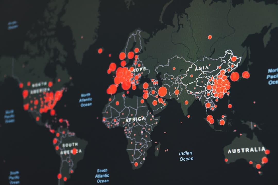
They are a poor choice when your data is a count rather than a rate, when the phenomenon does not respect administrative boundaries, or when you are mapping point events like individual incidents. For point patterns and continuous surfaces, other techniques such as graduated symbols, heat maps, or dot density are usually clearer. Knowing which technique fits which data is the core skill behind effective GIS data visualization.
Why must choropleth data be normalized?
This is the single most common and most damaging mistake in choropleth mapping. Shading regions by a raw count, such as total number of cases, almost always produces a map of population rather than a map of the phenomenon, because places with more people will have more of nearly everything. The fix is to normalize: divide the count by an appropriate denominator to produce a rate or density, such as cases per 100,000 residents or sales per square mile.
A worked example makes this concrete. Suppose you map total reported crimes by county and shade darkest where counts are highest. The darkest counties will simply be the most populous ones, which tells the reader almost nothing. Recompute the same data as crimes per 1,000 residents, and a very different and far more honest pattern emerges. Normalization is not a refinement; it is the difference between a map that informs and one that misleads. This kind of rigor is part of the discipline behind serious spatial data analysis.
How does classification change the story?
After normalizing, you must decide how to group your values into color classes. The classification method determines where the breakpoints between colors fall, and different methods can make the same data look dramatically different.
- Equal interval divides the value range into equal-size bands. Simple and intuitive, but a few extreme values can leave most regions in one or two classes.
- Quantile puts an equal number of regions in each class. Produces a balanced-looking map but can place very similar values in different classes and very different values in the same class.
- Natural breaks (Jenks) finds natural groupings in the data by minimizing variance within classes. Often the most faithful to the underlying distribution, and a sensible default for many datasets.
- Standard deviation shows how far each region sits from the mean, which is useful when the question is about outliers.
Because the method changes the message, the choice should be deliberate and disclosed. A responsible map maker tests more than one classification, picks the one that represents the data honestly, and notes the method so readers can interpret the colors correctly. The number of classes matters too: three to five classes are usually readable, while seven or more become hard for the eye to distinguish.
What makes a choropleth map readable?
Beyond normalization and classification, a few design choices separate a clear choropleth from a confusing one. Use a sequential color scheme (light to dark in a single hue) for data that runs from low to high, and a diverging scheme (two hues meeting at a neutral midpoint) for data with a meaningful center such as change from average. Keep the legend explicit, label the unit, and avoid rainbow palettes, which imply categories where the data is continuous. Accessibility matters as well: color choices should remain distinguishable for readers with color vision deficiency.
Context also helps. A choropleth rarely stands alone in decision-making. Pairing it with a short narrative, a supporting chart, or a comparison map turns a single image into an argument, which is the principle behind the StoryMaps approach covered in our piece on StoryMaps versus static maps.
How do you build a choropleth map in the Esri platform?
In the Esri ecosystem, choropleth maps are straightforward to produce. In ArcGIS Online, you add a layer with the boundaries and attributes, choose to show a numeric field, and select a counts-and-amounts (color) style, where the platform offers normalization and classification controls directly. In ArcGIS Pro, symbology is set through graduated colors with full control over classification method, class count, and color ramp. Both then plug into the wider platform: a finished choropleth becomes a layer in an ArcGIS Dashboard, a slide in an Esri StoryMap, or a view in an app. For the broader picture of how live maps drive decisions, see our guide to GIS dashboards.
Classification methods compared
Because the classification method changes the message, it helps to see the trade-offs side by side before choosing.
| Method | How it works | Best when | Watch out for |
|---|---|---|---|
| Equal interval | Splits the value range into equal-size bands | Values are evenly spread and the audience wants simple, even cutoffs | A few extreme values can collapse most regions into one class |
| Quantile | Puts an equal count of regions in each class | You want a visually balanced map with no empty classes | Can split near-identical values and group very different ones |
| Natural breaks (Jenks) | Finds natural groupings by minimizing within-class variance | You want the map to reflect the data’s real distribution | Class breaks are dataset-specific, so maps are harder to compare |
| Standard deviation | Shows distance from the mean in standard-deviation steps | The question is about outliers and above- or below-average areas | Requires a diverging color scheme and a statistically literate audience |
Natural breaks is a reasonable default for an honest first map, but the right choice depends on the question. Whatever you pick, state it in the legend or a note so readers can interpret the colors correctly.
Frequently Asked Questions
What is the difference between a choropleth map and a heat map?
A choropleth map shades predefined regions by a data value tied to each region. A heat map shows the intensity or density of point events as a smooth color surface that ignores administrative boundaries. Use a choropleth for rates by area and a heat map for clustering of individual points.
Should choropleth maps ever show raw counts?
Almost never. Raw counts make a choropleth read as a population map, because more populous regions have more of nearly everything. Normalize counts into rates, densities, or percentages so the color reflects the phenomenon rather than the number of people present.
How many color classes should a choropleth have?
Three to five classes are usually the most readable. Beyond about seven, adjacent shades become hard to tell apart, which undermines the map’s main advantage of being readable at a glance.
Which classification method is best?
There is no single best method. Natural breaks is a strong default because it respects the data’s distribution, but equal interval, quantile, and standard deviation each suit different questions. Test more than one and disclose the method you chose.
Can I make a choropleth map in ArcGIS Online?
Yes. ArcGIS Online builds choropleth maps through its counts-and-amounts color styling, with built-in controls for normalization and classification, and the result can be embedded in dashboards, apps, and StoryMaps.
Need a map that tells the right story to the people who fund your work? GeoLever turns spatial data into decisions, stories, and systems, scoped and quoted within 48 hours of a 30-minute discovery call. Book a discovery call or start with the StoryMap-in-a-Week starter.