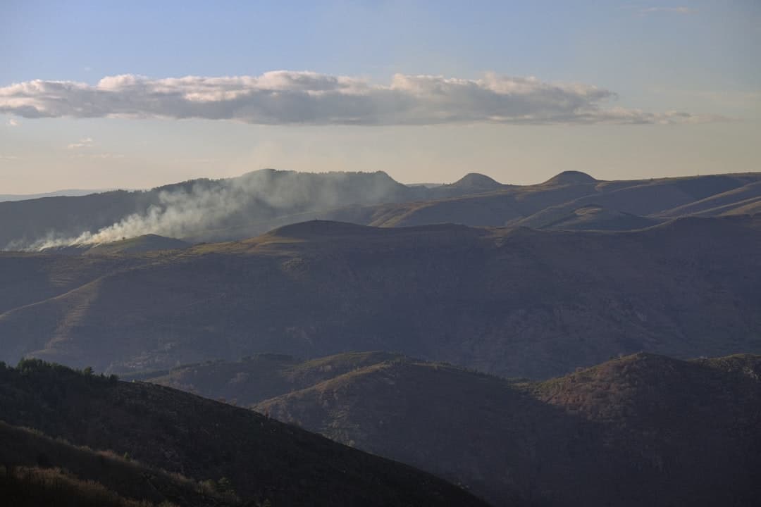
Wildfire risk assessment with geographic information systems (GIS) maps the conditions that drive fire, including vegetation fuel, terrain, weather, and the homes and infrastructure in harm’s way. GIS combines these layers to show where ignition is most likely, where fire would spread fastest, and which communities face the greatest exposure, giving agencies a clear basis for mitigation and response planning.
Key Takeaways
- Wildfire risk is a function of three things GIS can map directly: fuel, weather, and topography, weighed against the assets exposed.
- The National Interagency Fire Center reports that the United States averages roughly 7 million acres burned per year over the past decade, and the wildland-urban interface continues to expand.
- ArcGIS Online, ArcGIS Pro, and LANDFIRE fuel data form the backbone of most wildfire risk models.
- Weighted overlay analysis turns many risk factors into a single, ranked risk surface that planners can act on.
- Dashboards and field apps connect the risk model to real-time operations during fire season.
What is wildfire risk assessment with GIS?
Wildfire risk assessment is the process of estimating both the likelihood that fire will occur and the consequences if it does. In a geographic information system, that means converting the drivers of fire into spatial layers and combining them so each location carries a defensible risk score.
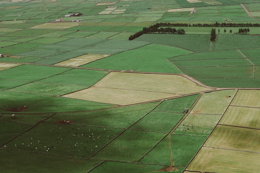
Two ideas sit at the center. Hazard describes the physical potential for fire, set by fuel, terrain, and weather. Exposure describes what stands to be lost, including homes, power lines, water supplies, and habitat. A remote ridge with heavy fuel has high hazard but low exposure. A subdivision pushed into dense chaparral has both. GIS lets you see that distinction across an entire county, which is exactly the kind of multi-factor reasoning that defines spatial data analysis.
What factors drive wildfire risk?
Fire behavior comes down to a well-understood set of inputs, and each one maps cleanly to a GIS layer.
| Risk factor | Why it matters | Common data source |
|---|---|---|
| Fuel type and load | Dense, dry vegetation burns hotter and spreads faster | LANDFIRE, NLCD land cover |
| Slope and aspect | Fire moves uphill quickly; south-facing slopes dry out faster | USGS digital elevation model |
| Weather and climate | Wind, temperature, and low humidity drive rapid spread | NOAA, RAWS weather stations |
| Historical fire perimeters | Past fires reveal patterns and recovery status | National Interagency Fire Center |
| Structures and infrastructure | Defines the exposure side of risk | County parcels, building footprints |
Topography deserves special attention because it is fixed and powerful. Slope, which is the steepness of the terrain derived from a digital elevation model, strongly shapes how fast a fire climbs. Aspect, the compass direction a slope faces, controls how much sun dries the fuel. A GIS model reads both straight from elevation data, so the terrain contribution to risk is consistent and repeatable.
How does the wildfire risk modeling workflow work?
Most assessments follow a weighted overlay approach, where many factors are scored, weighted by importance, and combined into one risk surface. ArcGIS Pro with the Spatial Analyst extension is the standard environment, with ArcGIS Online handling collaboration and sharing.
- Build the fuel and terrain layers. Bring LANDFIRE fuel models and a digital elevation model into the geodatabase, then derive slope and aspect from the terrain.
- Add weather and history. Incorporate fire weather patterns, drought indices, and historical fire perimeters to ground the model in observed behavior.
- Score and weight each factor. Reclassify every layer onto a common risk scale, then assign weights that reflect local fire drivers. Wind-driven landscapes weight weather higher; steep terrain weights slope higher.
- Run the weighted overlay. Combine the weighted layers into a single hazard surface, then intersect it with structures and infrastructure to map exposure and prioritize.
- Operationalize the results. Publish the risk map to interactive dashboards and field apps so prevention crews and incident teams work from the same picture.
The weighting step is where local knowledge matters most. A model tuned for the dry interior West will not transfer cleanly to the humid Southeast. A senior GIS engineer calibrates the weights to the landscape rather than accepting generic defaults, and that calibration is what separates a credible assessment from a colorful map.
How is GIS used during an active fire?
Risk modeling happens before fire season. The same spatial foundation pays off during an incident. Esri out-of-the-box tools turn the static risk map into a live operating picture without any custom development.
ArcGIS Field Maps lets crews report fire location, spot fires, and resource status from the field, and those updates appear instantly on a shared dashboard at the command post. Survey123 captures structured damage assessments after the fire front passes. ArcGIS Dashboards bring containment, evacuation zones, and asset status into one view that commanders and public information officers can both trust. The map stops being a planning document and becomes the shared situational awareness that coordinated response depends on.
Who uses wildfire risk assessments?
Fire and emergency management agencies are the core users, building prevention programs and pre-positioning resources from the risk map. Local governments use the same analysis to guide development codes, defensible space requirements, and capital planning in fire-prone zones, which connects to broader GIS for local government work and public safety programs covered in GIS for public safety.
Utilities assess risk along power corridors to prioritize vegetation management and grid hardening. Land trusts, parks, and forestry programs use wildfire models to plan fuel reduction and protect habitat. Insurers increasingly rely on spatial wildfire data to understand portfolio exposure. The common need is a defensible, location-specific view of where fire threatens people and assets.
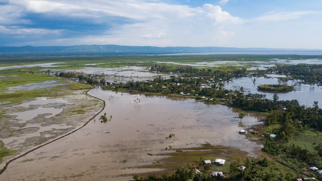
Why does the wildland-urban interface change the math?
The wildland-urban interface, the zone where homes and development meet undeveloped vegetation, is where wildfire risk concentrates most sharply. The United States Forest Service has documented steady growth in this interface, and that growth is the single biggest reason wildfire losses keep climbing. More homes sit beside more fuel every year.
For a GIS model, the interface shifts the emphasis from hazard to exposure. A fire in remote backcountry may have extreme hazard but little to lose. The same fire behavior next to a subdivision becomes a disaster. Mapping the interface precisely, using current building footprints and parcel data, lets agencies separate the places where fire is merely likely from the places where it is likely and catastrophic. That distinction is what makes a risk assessment actionable rather than academic.
It also points mitigation in a useful direction. Once the interface is mapped against the hazard surface, defensible space programs, fuel breaks, and home-hardening grants can target the parcels where they reduce the most risk per dollar. The map turns a broad goal into a ranked work list.
What are the limits of a wildfire risk model?
A good assessment is honest about what it cannot do. It cannot predict a specific ignition or the exact path of a future fire, because weather on the day of an event introduces real uncertainty. What it does well is rank relative risk across a landscape, which is precisely what prevention planning needs. Treating a risk surface as a forecast of one fire would overstate it, while using it to prioritize fuel reduction and resource staging uses it correctly.
Model quality also depends on keeping fuel data current. Vegetation recovers after a burn and grows back over years, so a fuel layer that is several years stale can misrepresent today’s conditions. Refreshing fuel and exposure data before each season keeps the assessment grounded in reality.
What does a GIS wildfire risk assessment cost?
As general market context, a focused wildfire risk study for a single jurisdiction often falls in the low-to-mid four figures, while a comprehensive countywide or regional assessment with detailed exposure analysis and operational dashboards commonly reaches the mid five figures. The main cost drivers are the size of the study area, the resolution of fuel and terrain data, and whether the deliverable includes live operational tools or a one-time report.
If you want a fast, high-impact starting point, a productized engagement keeps risk low. GeoLever’s StoryMap-in-a-Week starts at $3,500 and can present an existing risk assessment as a clear story for a council or community meeting. Full modeling projects are scoped and quoted within 48 hours of a 30-minute discovery call. Teams sizing the investment often find our GIS ROI framework useful for valuing prevention against the cost of a single avoided loss.
Wildfire risk does not announce itself evenly across a landscape. A well-built GIS assessment shows exactly where it concentrates, so prevention dollars and response crews go where they matter most. To scope an assessment, explore our dashboard development services or reach out.
Frequently Asked Questions
What data is most important for wildfire risk modeling?
Fuel data and terrain data carry the most weight. LANDFIRE fuel models describe what will burn, and a digital elevation model provides the slope and aspect that govern spread. Weather and historical fire perimeters refine the model, but fuel and terrain are the non-negotiable foundation.
What is weighted overlay analysis?
Weighted overlay is a GIS method that scores several risk layers on a common scale, multiplies each by an importance weight, and combines them into a single risk surface. It lets you blend many factors, such as fuel, slope, and weather, into one ranked map that reflects how those factors actually drive fire in a given area.
Can GIS predict exactly where a fire will start?
No model predicts a specific ignition. GIS predicts relative likelihood and consequence, showing which areas are most prone to fire and most damaging if one occurs. That probabilistic view is what prevention and response planning actually need.
How does GIS help during fire season as well as before it?
The pre-season risk model becomes the base layer for live operations. ArcGIS Field Maps, Survey123, and ArcGIS Dashboards turn it into a real-time common operating picture for crews and commanders, with field reports and damage assessments flowing in continuously.
How often should a wildfire risk assessment be updated?
Reassess after major fires, significant development in the wildland-urban interface, or notable vegetation change. Many agencies refresh the model annually before fire season, since fuel conditions and exposure both shift from year to year.